The Process Behind a Good Dashboard
Building a crime dashboard for the New Orleans City Council.
A comment on a previous post about dashboards asked “Could you draft a post on your process of us data nerds?”
That’s a good question! So let’s dive in.
First off, there are tons of bad dashboards out there. Dashboards that are confusing, provide only one piece of information, or have color pallets that hurt the eyes. Hopefully my dashboards don’t do that!
I have built (along with my partner Ben Horwitz and AH Datalytics teammates Rosana Guernica, Rachel Weinstein, and Haley Shaeffer) dozens of different dashboards for my company’s website, the New Orleans City Council, and more, and I like to think that each dashboard follows at least four basic tenants:
Dashboards should be pretty.
Dashboards should be easy to read.
Dashboards should be multi-faceted.
Dashboards should enable users to tell interesting stories with data.
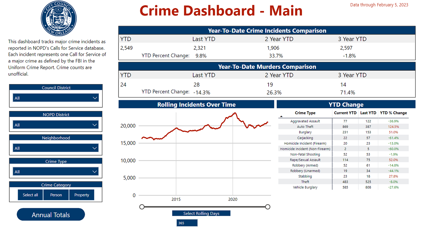
The New Orleans City Council Crime Dashboard was the first dashboard I built for the City Council way back in 2018 and it has been through many iterations to reach its current form. This dashboard uses publicly available NOPD Calls for Service data (a record of all 911 calls and officer-initiated incidents) to approximate crime trends in New Orleans.
The word ‘approximate’ is key because Calls for Service will give us accurate albeit imprecise crime totals. The advantage of using Calls for Service is that crime trends can be accurately measured in near real time rather than waiting weeks or months (or longer) for official, less detailed data to be released.
So here is the crime dashboard:
This dashboard measures crime way back to 2011. Only Calls for Service incidents that relate to Uniform Crime Report Part I crime categories are kept and categorized as crimes. Incidents are geo-located to a neighborhood and City Council district so that they can be filtered geographically or by crime type.
One particular challenge with this dashboard was how to handle murders. Calls for Service are great, but they only count incidents while an accurate murder count requires victim totals. A triple murder, for example, might show up as one fatal shooting incident. Calls for Service — at least in New Orleans — also doesn’t differentiate a justifiable homicide from a murder which further complicates matters. Finally, Calls for Service data won’t show murders that either started as something else (say, an unclassified death that the coroner deems was a murder weeks later) or a shooting where the person was injured in a previous year and died in this year.
The solution was to create a manual process that allows us to add victims, overwrite an incident type if it needs to be changed, and then sum up the number of murder victims. We then check our murder figures against NOPD’s monthly in order to ensure we aren’t missing incidents. This is the only manual process in the entire dashboard.
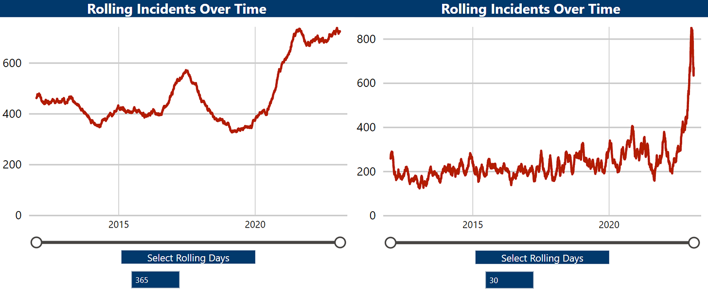
With this dashboard you can compare year-to-date (YTD) totals for the last few years of incidents and murders. Of course YTD totals can be useless, especially early in the year, so this dashboard gives a graph of incidents rolling over a time period that the user can change. Below, for example, are shooting incidents rolling over 365 days (left) and auto theft incidents rolling over 30 days (right).
Both graphs use different time periods tell important stories about crime trends. The former shows how much gun violence has risen in New Orleans over the last few years while the latter shows a remarkable surge in auto thefts as well as a potential decline of late.
Returning to the checklist:
Dashboards should be pretty. I think this dashboard fits the bill. It has a good color combination, is not overly aggressive in the graphs and tables, and has decent white space if I do say so myself.
Dashboards should be easy to read. I don’t know what others think, but I think this dashboard is easy to read. The filters are not complicated and there are numerous ways to digest data (current year, previous years, and rolling).
Dashboards should be multi-faceted. This dashboard is definitely multi-faceted. In addition to multiple graphs and tables on the main page there is a second page with totals by year dating back to 2011. That page can be filtered by month so you can see how many thefts there were in the French Quarter for every February from 2011 to 2023 if you wanted.
Dashboards should enable users to tell interesting stories with data. This dashboard gets more local media attention than any other dashboard we have produced. You can describe how crime this year compares to crime in previous years, but the rolling graph allows for the telling of tons of interesting stories: The city’s progress (or lack thereof) against gun violence, surging vehicle burglaries and auto thefts, pickpockets in the French Quarter over Mardi Gras, whether certain law enforcement tactics are having a measurable impact on crime, and more.
The drawbacks to this dashboard mostly come from imperfections in using Calls for Service to measure crime. Not all crime gets reported to the police and longer response times can lead to crime being further underreported. But we cannot measure incidents that aren’t successfully reported.
One other drawback is that we are using PowerBI which does not allow users on public dashboards to download data. This is a shame and degrades the overall user experience in my opinion, but there isn’t much we can do about it.
Overall, this dashboard provides a powerful means of communicating a wide array of data related to crime in New Orleans. The data is not perfect and neither is the dashboard, but tackling this topic alongside other important issues such as response times, staffing, and incarceration allow for a far fuller picture of criminal justice trends in New Orleans than would be possible without the dashboards.


